
 MODULAR TYPE

 Playing around with the chosen design layout. I forgot to say that we were working in a group and each had to design a modernist poster for Germany- we came up with a colour scheme and format and they looked great as a series.
 Modernist typography poster. I started off this project in the wrong mind set. During the time period we studied (1920-1960 Germany) designs began to create Dada designs like these. These did not have the modern principles which the brief was asking for...so....I started again (which is always fun). I thought I should stick these up anyway...I don't really like them but still good to show.

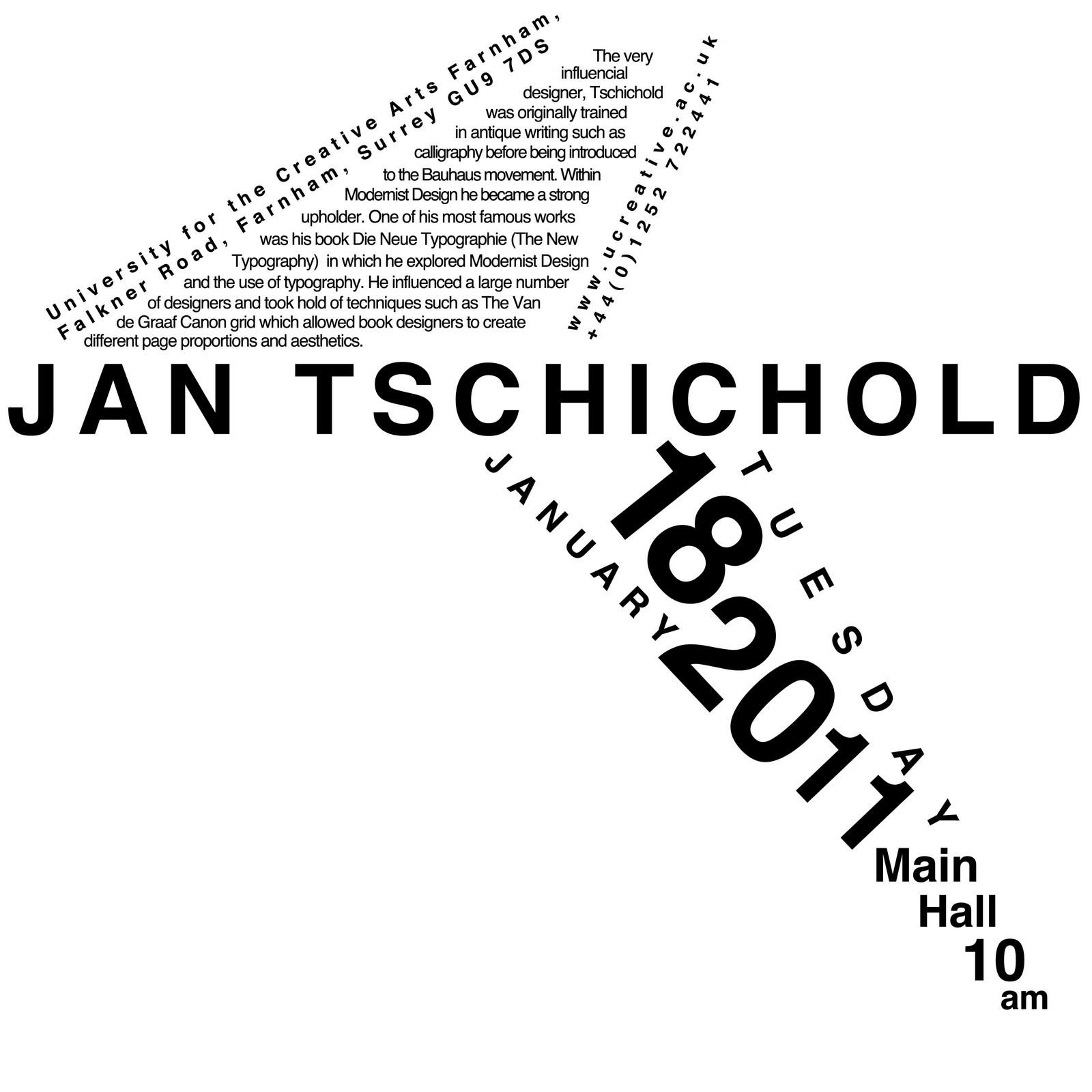
 These are a few of my layout options for a project in which we had to design a poster advertising a lecture by a chosen typographical designer, taking inspiration from their work. There were a lot more layout designs that I came up with but I kept it to the minimum as to not bore you. We had to include a strong grid system and it would only be black type on a white background and also a square format.


 So...the brief was to create a font that represents who you are as both and designer and person and to then present your name in the hand made font. This is what I have so far! Had a nice bit of brainstorming time and took on the fact that i played the cello for 10 years which allowed me to develop creativity in a musical sense as well as an artistic sense. Once I started to look closer at my cello I realised I could find and create all of the letters of the alphabet which quite obviously was a great relief. Once I started to play around with the photographed parts and put them together I thought it started to look pretty successful! Plus its a bonus that you can actually read it...assuming you actually can?


 My first draft for the fashion poster! Not quite finish I need to add in some passport style photos of people on the left! First bit of work I've done in a week! Stupid stupid stupid stupid chicken pox! Who gets them when you're 19? really???
 Riiiight this is finally finished I think! All the tutors say its great which is pretty sweet! Im happy with it soooo.....im going to stop making changes because I have plenty of other imagery to do!
 First time ive ever properly attacked the sewing machine! The poor little thing had a hard time and kept breaking but it just about managed! The background image was solvent printed and i used the sewing machine to do line drawing over the top and also sewing in some patterns/images I found around the studio! I dont even care if it doesn't look that good because it was pretty fun!

 I did these this morning...yesss its not even 10 yet! lets be a little more obsessed yeah? anyway...the top fashion one was inspired by Owen Gildersleeve who did a similar thing using electrical wire! i thought it looked pretty cool! hands down better than mine but to be fair...wool is hard to handle! and the bottom textiles made out of buttons was inspired by this typographical piece i saw in my Playful Type book! In that one they left the letters blank i.e. outlined the letters in bottons but to be honest i didnt really find it that comprehendible so I decided against doing that and went for the simple, i will definitely be able to read that, way! Again, they wont be used just on their own i highly doubt but i plan to use them within other imagery!


