Wednesday 24 March 2010


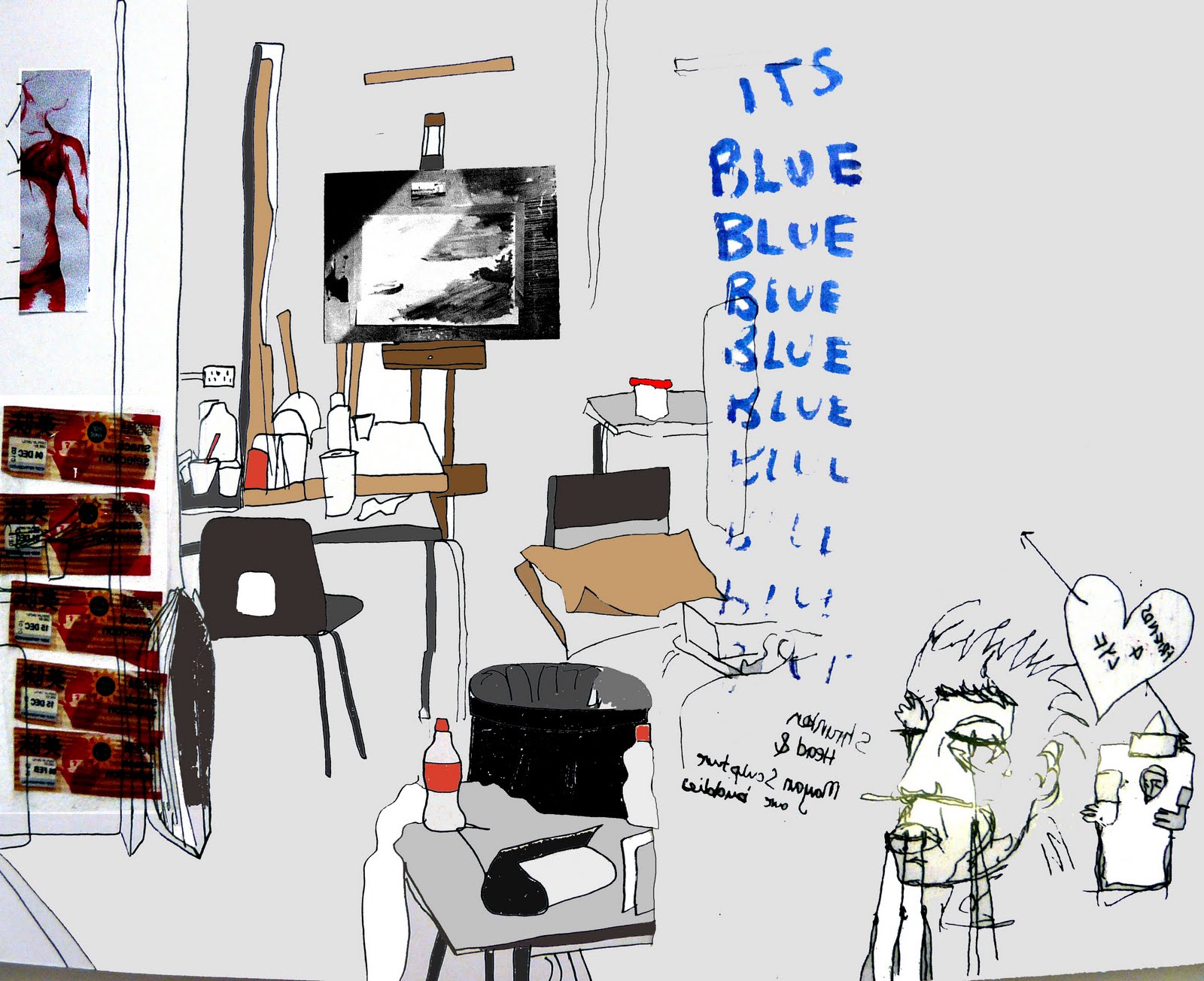
I was just playing around with simplifying my studio idea but illustrating a long desk as you can see! I dont really know how I feel about it, its ok, its more how a promotional poster should be looking I guess but is the slogan a bit cheesy? Is the typography right?
But also I made a mistake when I was playing with it on photoshop and ended up with the top image which is just text but I quite liked how simple it was! I wont use it for the project...but i still think its pretty cool!

I boshed together a couple of collages of the doodles I came across in the studios...these are the results! They will not be used for my final designs...BUT maybe in fanzine/magazine...we'll see!


At the moment I'm doing the Promotion for our college's final show. This involves making the invitations, posters for each pathway and an overall UCA one, a map for the show, signage, a student profile form and other promotional aspects such as making a fanzine or magazine or something like that! These were my main chosen initial ideas but they will be developed and most likely simplified. Im basically going to have to try LOADS of different things to try and get it right....we'll see how that goes!
Anyway...yeah so my concept is to look at our studios and represent out college in that sense as its a very important part to our development and I also noticed that there were doodles EVERYWHERE, which you can see collaged over my illustrations.