
 MODULAR TYPE

 Playing around with the chosen design layout. I forgot to say that we were working in a group and each had to design a modernist poster for Germany- we came up with a colour scheme and format and they looked great as a series.
 Modernist typography poster. I started off this project in the wrong mind set. During the time period we studied (1920-1960 Germany) designs began to create Dada designs like these. These did not have the modern principles which the brief was asking for...so....I started again (which is always fun). I thought I should stick these up anyway...I don't really like them but still good to show.

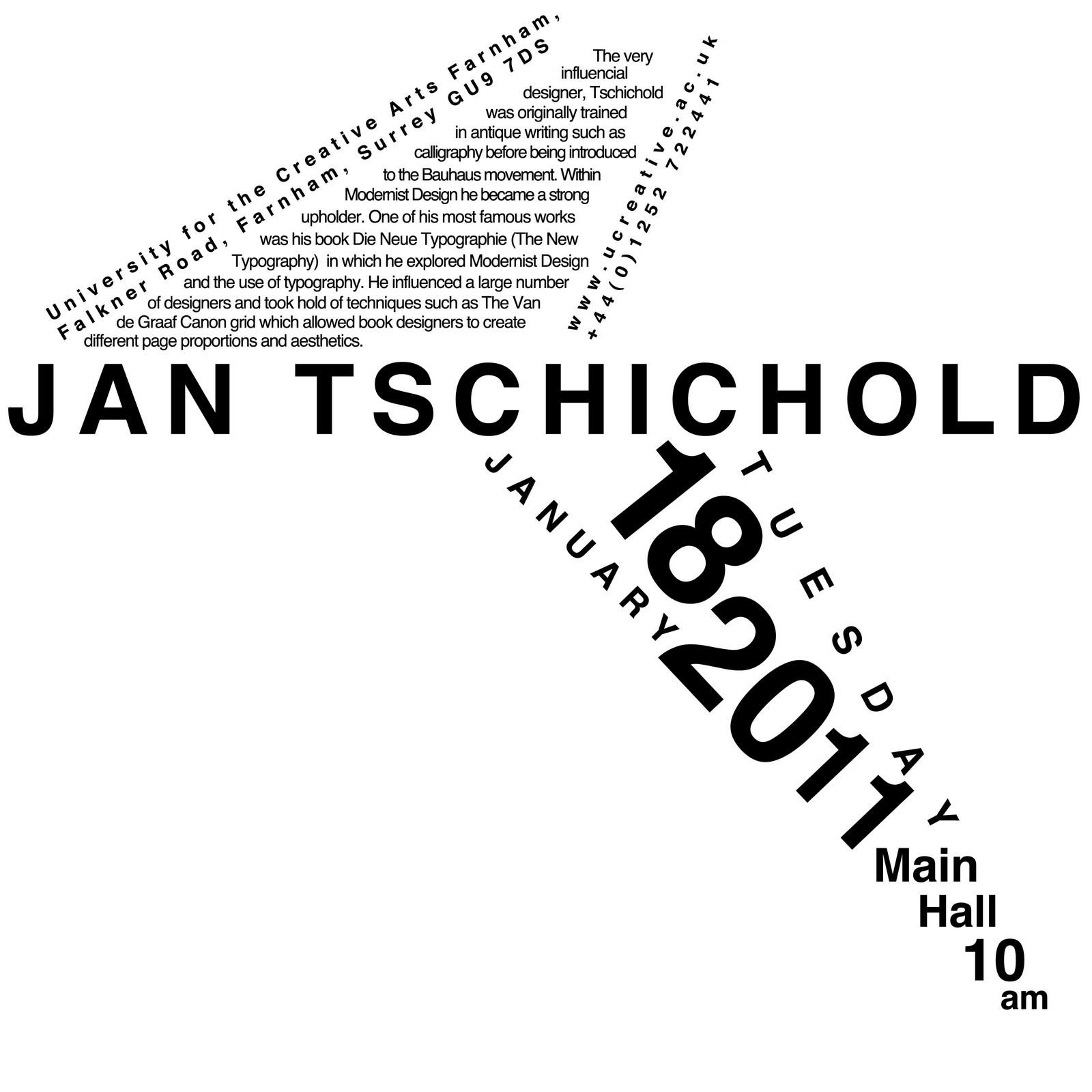
 These are a few of my layout options for a project in which we had to design a poster advertising a lecture by a chosen typographical designer, taking inspiration from their work. There were a lot more layout designs that I came up with but I kept it to the minimum as to not bore you. We had to include a strong grid system and it would only be black type on a white background and also a square format.


